Blog

Carving an Alphabet!

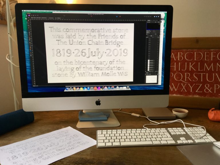
Once I was happy with the layout John showed me how to reverse the image on the computer. This was in order to print the layout and transfer it directly on the surface of the slate using cellulose thinners, a trick that can save hours of tracing!

Print out in reverse before transferring using cellulose thinners

By painting the surface of the slate with the thinners the reverse print is then pressed onto the slate using a printing roller. This took a bit of practice to get the right amount of thinners and pressure from the roller and I am yet to have practiced on sandstone to see if the technique is suitable for a more porous stone.

Revealing transfer
Layout transfered- note the chalked lines used to place the print out precisely onto the stone.

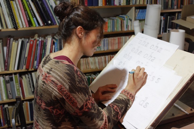
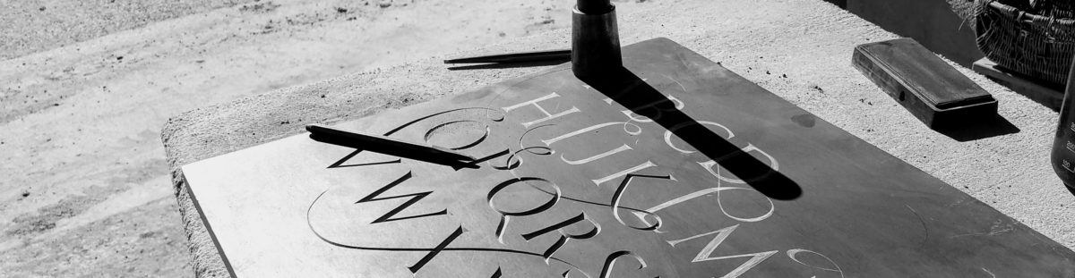
Once the layout was transferred (..in a matter of minutes!) I started carving. This is probably where I feel most comfortable and at ease. I started the journeyman scheme knowing that my weakest side was the drawing and design element (arguably the most important!) and so it has been this that John and I have been focussing on during my 8 week placement. Having said that, it felt great to finally get a chisel and carve! so I really enjoyed these couple of days. The stone was a spare piece of Chinese slate that John had in his workshop so that was interesting as not a stone I had ever encountered before. It was extremely layered and very hard so it was difficult to get a consistant 90′ angle on the v cut but because of the hardness it did produce a lovely clean, sharp edge.

Letter R V-cut in Chinese Slate
Me carving!

I haven’t taken a photo of the finished alphabet yet as it is still waiting to be mounted onto the wall in the workshop. Michelle and I have a lot of lettering pieces, including drawings, on the walls of our workshop as we have found it so useful to show clients the various lettering styles and types of stones .I will hopefully add a final photo of the alphabet this week….

Letter Design and Composition

In my final two weeks of the Journeyman placement we looked at the variations in letter design and composition, experimenting with more ‘free’ and less traditional letterform. This led me to have a go at designing and carving my own letters.

Firstly John had me sit and listen to a variety of music, ranging from classical opera to cats wailing! Whilst listening to the music I was to draw the alphabet, allowing the music to inform the ‘feel’ of the letters.

An example of the experimental letters informed by the music…this one was maybe a bit angry?!

Another exercise was to draw as many versions of a letter as possible during 60 seconds. I found this a little difficult at first but then found it very enjoyable and could feel myself experimenting further with the concept of each letter, how we recognise it and how far one could push the boundaries of the letter before it became something else.

The letter A?
The letter C?

I then spent some time looking at a variety of more experimental lettering in Johns library. This ranged from the early ‘naive’ christian inscriptions to artists such as David Jones, Ralph Beyer and Lisbet Boudens.

A page from my sketch book looking and analysing others experimental lettering

Taking what I had learnt from the exercises earlier on in the week and the observations of my research I then started to design my own letters. I wanted a fairly traditional letter but with more movement and variety then the formal Roman capitals.

The beginnings of my alphabet with a few corrections and suggestions marked on by John .
My final alphabet ready to print off and transfer onto the stone!

Lettering Workshop at Nant Hirwen

At the end of July I had the opportunity to assist John with the set up and running of a 5 day lettering workshop at a small farm in rural Wales.

The students ranged from relative beginners to fully fledged stone/letter carvers, all with their own projects and focusses for the week. To say that I learnt a lot from this experience is an understatement. There is something about teaching that forces you to analyse and think about why you do things in a certain way. Its true when they say that ‘In learning you will teach and in teaching you will learn’.

The preparation for a course like this takes a long time and I was glad to help John for the final few days beforehand, setting up the easels, clearing the barns and preparing the stones for the students to work on. John has used this venue a number of times before and it really is a great set up! The students have the option of staying in a lovely bunkhouse on site and the lunch is provided by a local woman who bakes the best cakes! The course started with a short intro from John and then the students were encouraged to get straight into carving, all carving a letter T in slate that John had drawn up before hand. This helped to warm up and allowed John to see what stage each student was at in their letter carving.

The workshop all set up at the beautiful farm of Nant Hirwen
Easels set up in the old barn
Assisting John in teaching lettering – I learnt a lot!

After a session of carving the class divided and sat down to either study the the classical proportions of Roman capitals with me or took part in some experimental exercises with John in order to create a freer lettering style. These exercises included listening to an eclectic range of music whilst drawing, allowing the music to influence the feel of the letters…this ranged from heavy metal music to cats wailing!! The week before the class I was used as a test dummy for this and will be writing another post about the results!!

During the week John also organised a trip to the local churchyard to look at the historical letterforms and a few of his carved headstones. This was a really interesting opportunity to see and discuss all the little details with each other, everyone picking up and seeing different things.

School trip to the Llansillin Churchyard
Studying the old letterforms and idiosyncrasies of historic headstones

Once back everyone started on their individual projects. John had also invited Tom Perkins down for a couple of days to speak about his work and current projects and to give some extra tuition to the students.

Guest visit from Tom Perkins

These types of workshops and courses are so valuable for everyone, from beginner to professional letter carver for so many reasons. For beginners its great for building confidence and to get an idea of what is achievable with a little practice and knowledge. And for the more experienced its so good for and picking up on and ironing out any bad habits that have developed in your practice. But most of all I feel its so beneficial to network and socialise with fellow carvers, to share ideas and stories and to support each other.

The end of a fantastic week of letters!

Capitals and Layout

Due to commitments back in the Scottish Borders I am completing my LCAT Journeymen placement in 2 week blocks throughout the summer months. This arrangement seems to be working really well for me as I can go home, digest and put into practice what I have learnt, ready and eager with questions for John when I return to Wales!

This time, having previously concentrated on lower case letter forms, we decided to look at capitals and layout more closely…

I began by looking back at the development of the capital letter from Roman Trajan Capitals through to modern letterforms. During this time I tried to analyse the individual characteristics of each letterform such as angle, thickness and termination for the stokes. Below is a sheet from my drawing sketch book where I studied the various developments in the letter R.

Analysing the capital ‘R’ in various letterforms

The next exercise was to experiment with spacing and design. John felt that this was best done using a brief from a real commission. After shadowing a meeting between John and the client, spending time talking with them about the wording and design, I set about producing quick working thumbnail sketches in order to play about with different layout and design options. These were purely to give the client an impression of what the final design could be.

Final thumbnail sketches developed firstly by hand and then refined in Photoshop

After deciding on the final design the next step was to draw out the letters by hand, taking into account the letters relationship to one and other, spacing and consistency.

Drawing out full size lettering by hand

Below is the finished layout.

Calligraphy and Minuscules

Thanks to the Lettering and Commemorative Arts Trust Journeyman Scheme and the Worshipful Company of Masons in Glasgow and London I have been given the fantastic opportunity to spend 8 weeks under the tuition of lettering designer John Neilson at his workshop in rural North Wales. Over the summer I will be training with John in order to improve my drawing and design skills in relation to lettering as well as helping John as much as I can around his workshop.

The first exercise was to look at the development of the minuscule (lower case) letters and in particular the Caroline minuscule and Edward Johnston’s Foundational. Here I concentrated on the basic proportions of the letter, the pen angle, and ultimately what gives the letter its character. I wasn’t concerning myself too much with spacing but rather the way in which each stroke begins and ends and trying to maintain a reasonable consistency..this was very hard! However, completely addictive and hours seemed to fly by! I definitely need to practice more as it is very hard to control the end result and there is no rubbing it out and starting again!

Practicing Edward Johnston’s Foundational hand using pen and ink

Once I started to understand the influence of the pen on the letter forms I then began to study the developments of lower case letters from pen to print to stone, taking note of the differences between them such as how each stroke terminates, the nature of the curve etc. This included the Old style/Transitional/Modern printing types such Bembo, Baskerville and Bodoni, but also present day carved alphabets by the likes of Eric Gill, Tom Perkins and Michael Harvey. John’s library is extensive and I feel very privileged to have had so much time to sit and pick through the various special books he has!

John’s inspiring collection of books
Analysing lower case alphabets

The next step was to take all the things I had learnt over the past week to develop my own drawn lower case alphabet. I had a commission I was working on back home which seemed like a great opportunity to use as a case study for this. The job was a large commemorative plaque celebrating the bicentenary of a local landmark in Berwick Upon Tweed. It was to be in a local pink sandstone which is relatively soft and coarse so the letters needed to be fairly substantial and 25mm high minimum. I therefore decided to develop a modern sans serif style that would be more suited to the stone type.

A sample of developing letters in my workbook

Once I had decided on the letter form John showed me the basics of Adobe Photoshop (although I am since using a programme called Affinity which seems to do the same thing!) in order to fine tune the layout of the plaque. Although this has taken me many days to even begin to get to grips with the programme and its capabilities, I really feel that it has so many benefits to the design process in the long run. I think I will always draw the letters by hand as it is something I enjoy and need to progress and improve but by being able to move, amend and revert the layout helps so much with the creative process involved in the design and layout stage of lettering.

Getting to grips with computers!

When I was happy with the layout and spacing I was able to print the design full size and then transfer directly onto the stone using carbon paper. Below is a photo of the plaque in progress back home at the workshop at Hutton Stone Ltd. I will post a photo when it is finished in July!

Work in progress after transferring the design onto stone