Thanks to the Lettering and Commemorative Arts Trust Journeyman Scheme and the Worshipful Company of Masons in Glasgow and London I have been given the fantastic opportunity to spend 8 weeks under the tuition of lettering designer John Neilson at his workshop in rural North Wales. Over the summer I will be training with John in order to improve my drawing and design skills in relation to lettering as well as helping John as much as I can around his workshop.
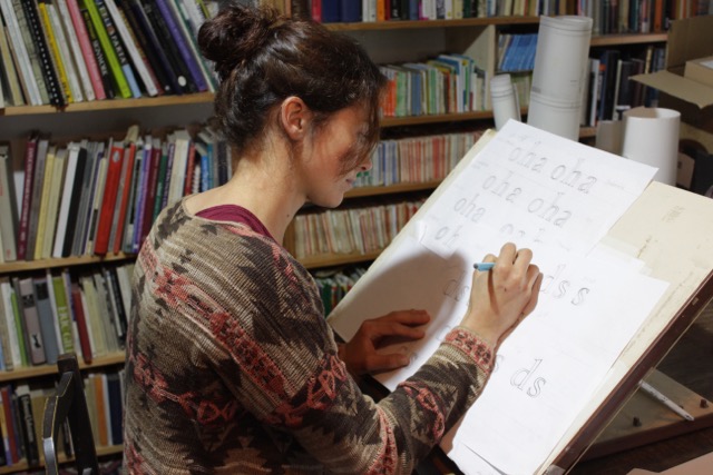
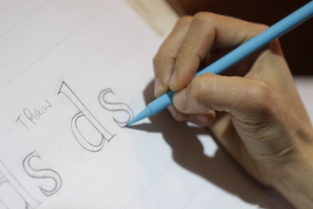
The first exercise was to look at the development of the minuscule (lower case) letters and in particular the Caroline minuscule and Edward Johnston’s Foundational. Here I concentrated on the basic proportions of the letter, the pen angle, and ultimately what gives the letter its character. I wasn’t concerning myself too much with spacing but rather the way in which each stroke begins and ends and trying to maintain a reasonable consistency..this was very hard! However, completely addictive and hours seemed to fly by! I definitely need to practice more as it is very hard to control the end result and there is no rubbing it out and starting again!

Once I started to understand the influence of the pen on the letter forms I then began to study the developments of lower case letters from pen to print to stone, taking note of the differences between them such as how each stroke terminates, the nature of the curve etc. This included the Old style/Transitional/Modern printing types such Bembo, Baskerville and Bodoni, but also present day carved alphabets by the likes of Eric Gill, Tom Perkins and Michael Harvey. John’s library is extensive and I feel very privileged to have had so much time to sit and pick through the various special books he has!

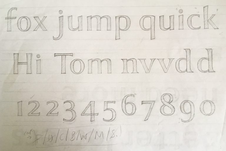
The next step was to take all the things I had learnt over the past week to develop my own drawn lower case alphabet. I had a commission I was working on back home which seemed like a great opportunity to use as a case study for this. The job was a large commemorative plaque celebrating the bicentenary of a local landmark in Berwick Upon Tweed. It was to be in a local pink sandstone which is relatively soft and coarse so the letters needed to be fairly substantial and 25mm high minimum. I therefore decided to develop a modern sans serif style that would be more suited to the stone type.
Once I had decided on the letter form John showed me the basics of Adobe Photoshop (although I am since using a programme called Affinity which seems to do the same thing!) in order to fine tune the layout of the plaque. Although this has taken me many days to even begin to get to grips with the programme and its capabilities, I really feel that it has so many benefits to the design process in the long run. I think I will always draw the letters by hand as it is something I enjoy and need to progress and improve but by being able to move, amend and revert the layout helps so much with the creative process involved in the design and layout stage of lettering.
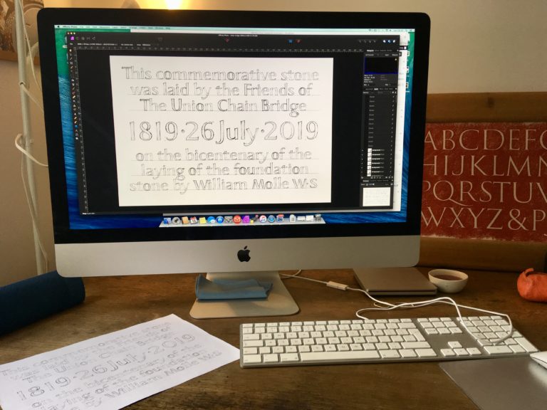
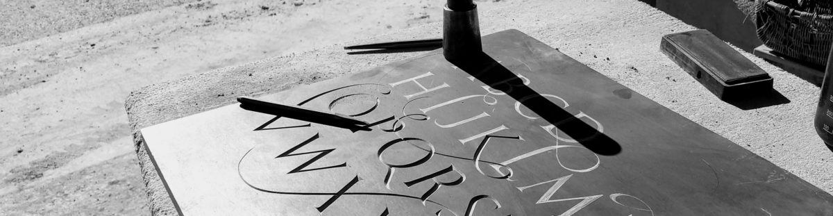
When I was happy with the layout and spacing I was able to print the design full size and then transfer directly onto the stone using carbon paper. Below is a photo of the plaque in progress back home at the workshop at Hutton Stone Ltd. I will post a photo when it is finished in July!

