Due to commitments back in the Scottish Borders I am completing my LCAT Journeymen placement in 2 week blocks throughout the summer months. This arrangement seems to be working really well for me as I can go home, digest and put into practice what I have learnt, ready and eager with questions for John when I return to Wales!
This time, having previously concentrated on lower case letter forms, we decided to look at capitals and layout more closely…
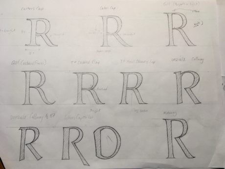
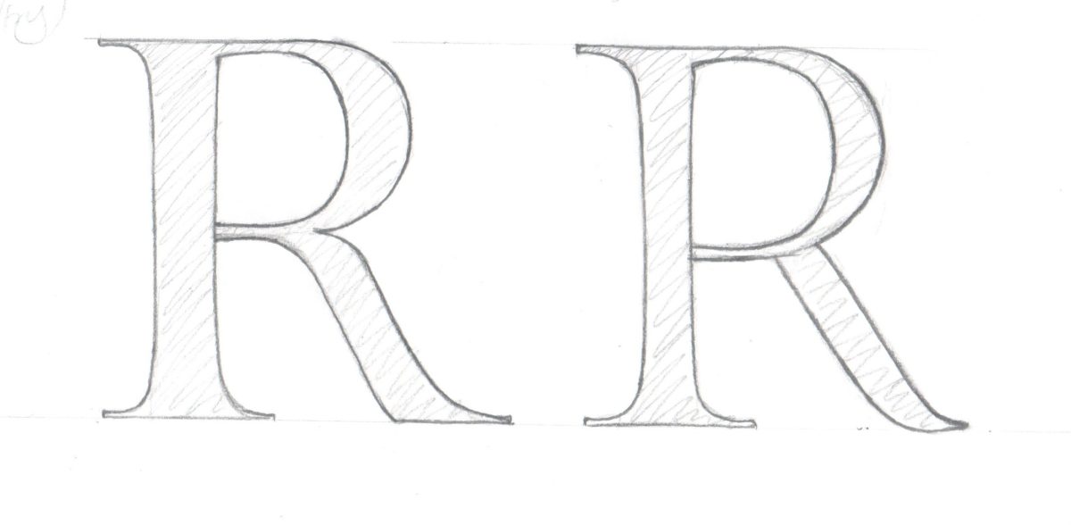
I began by looking back at the development of the capital letter from Roman Trajan Capitals through to modern letterforms. During this time I tried to analyse the individual characteristics of each letterform such as angle, thickness and termination for the stokes. Below is a sheet from my drawing sketch book where I studied the various developments in the letter R.

The next exercise was to experiment with spacing and design. John felt that this was best done using a brief from a real commission. After shadowing a meeting between John and the client, spending time talking with them about the wording and design, I set about producing quick working thumbnail sketches in order to play about with different layout and design options. These were purely to give the client an impression of what the final design could be.

After deciding on the final design the next step was to draw out the letters by hand, taking into account the letters relationship to one and other, spacing and consistency.

Below is the finished layout.


