In my final two weeks of the Journeyman placement we looked at the variations in letter design and composition, experimenting with more ‘free’ and less traditional letterform. This led me to have a go at designing and carving my own letters.
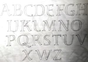
Firstly John had me sit and listen to a variety of music, ranging from classical opera to cats wailing! Whilst listening to the music I was to draw the alphabet, allowing the music to inform the ‘feel’ of the letters.

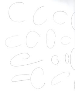
Another exercise was to draw as many versions of a letter as possible during 60 seconds. I found this a little difficult at first but then found it very enjoyable and could feel myself experimenting further with the concept of each letter, how we recognise it and how far one could push the boundaries of the letter before it became something else.


I then spent some time looking at a variety of more experimental lettering in Johns library. This ranged from the early ‘naive’ christian inscriptions to artists such as David Jones, Ralph Beyer and Lisbet Boudens.

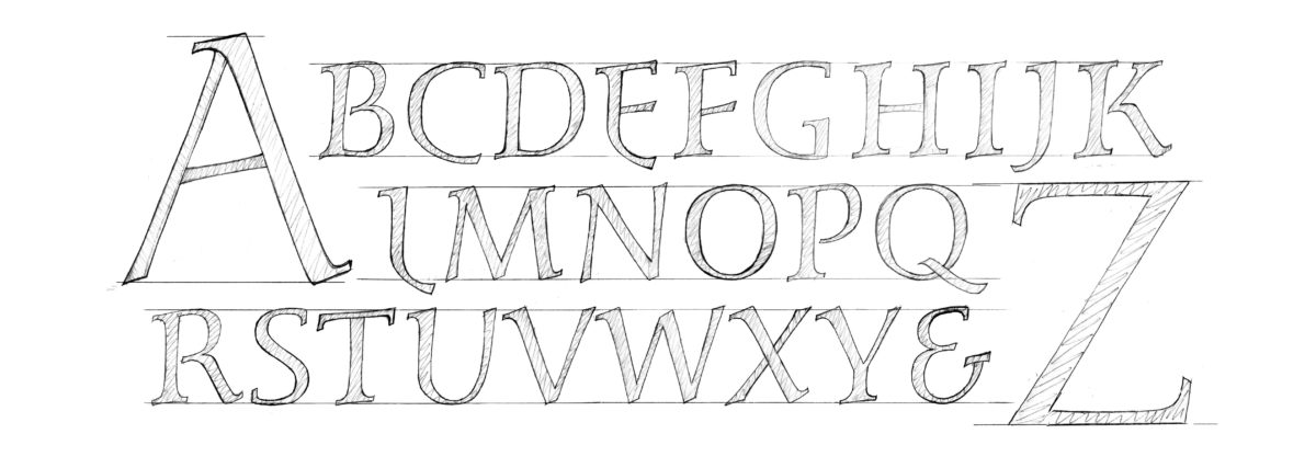
Taking what I had learnt from the exercises earlier on in the week and the observations of my research I then started to design my own letters. I wanted a fairly traditional letter but with more movement and variety then the formal Roman capitals.


